
Quick Analysis Tool in Excel: Your One-Click Data Hack
If you’re still manually adding SUM formulas in 2026, you’re wasting time. Excel has a one-click analysis engine most users completely ignore.
Instead of digging through the Ribbon, writing basic formulas, or manually inserting charts, you can highlight your data and let the Quick Analysis tool in Excel suggest totals, charts, formatting, and even Pivot Tables instantly.
It turns raw numbers into insights in seconds. Whether you’re a student analyzing marks, a sales executive reviewing monthly targets, or an accountant checking totals, using the Quick Analysis tool in Excel eliminates repetitive work and speeds up your workflow dramatically.
Let’s break down how to master this built-in feature.
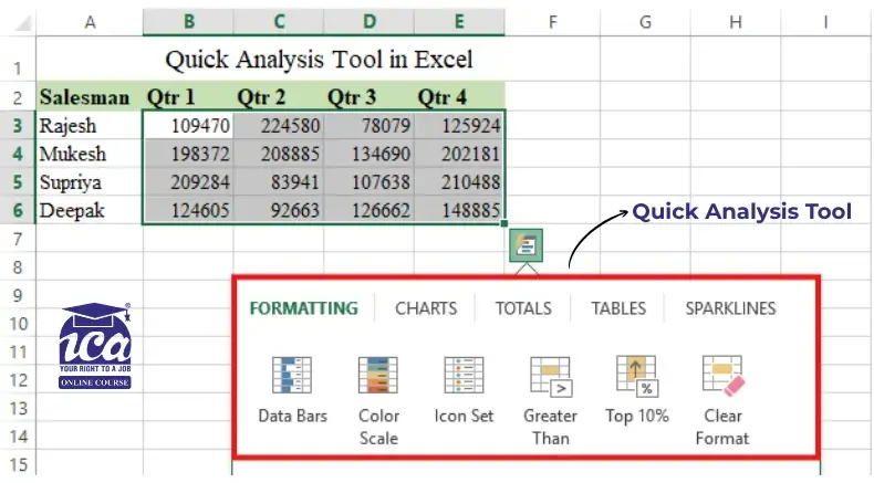
Table of Contents
- What is the Quick Analysis Tool in Excel?
- Where to Find Quick Analysis Tool?
- Key Features and Functions
- How to use Quick Analysis Tool in Excel
- Why Use Quick Analysis Ctrl + Q ?
- Quick Analysis Examples
- Troubleshooting: Why Your Quick Analysis Tool Isn’t Working
- Best Practices for Success
- The “Exit Strategy”: When to Stop Using Quick Analysis
- Conclusion
- Frequently Asked Questions
What is the Quick Analysis Tool in Excel?
The Quick Analysis Tool is a built-in Excel feature designed to save you time. Instead of hunting through the Ribbon for formulas or formatting, this “one-stop shop” gives you instant access to charts, tables, and calculations with a single click.
Think of it as a smart assistant that looks at your data and suggests the best ways to visualize or summarize it.
Where to Find Quick Analysis Tool?
The tool is available in Excel 2013 and all later versions (including Excel 2019, 2021, and Microsoft 365) for both Windows and Mac.
To activate it:
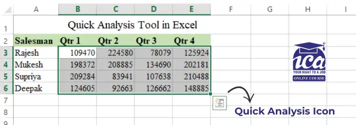
- Select your data: Highlight a range of cells (at least two cells with data).
- Look for the Magic Icon: A small square icon with a lightning bolt will pop up at the bottom-right corner of your selection.
- Click (or Shortcut): Click that icon, or simply press Ctrl + Q on your keyboard.
Key Features and Functions
The tool is divided into five main categories. Each one serves a specific purpose for data visualization and calculation.
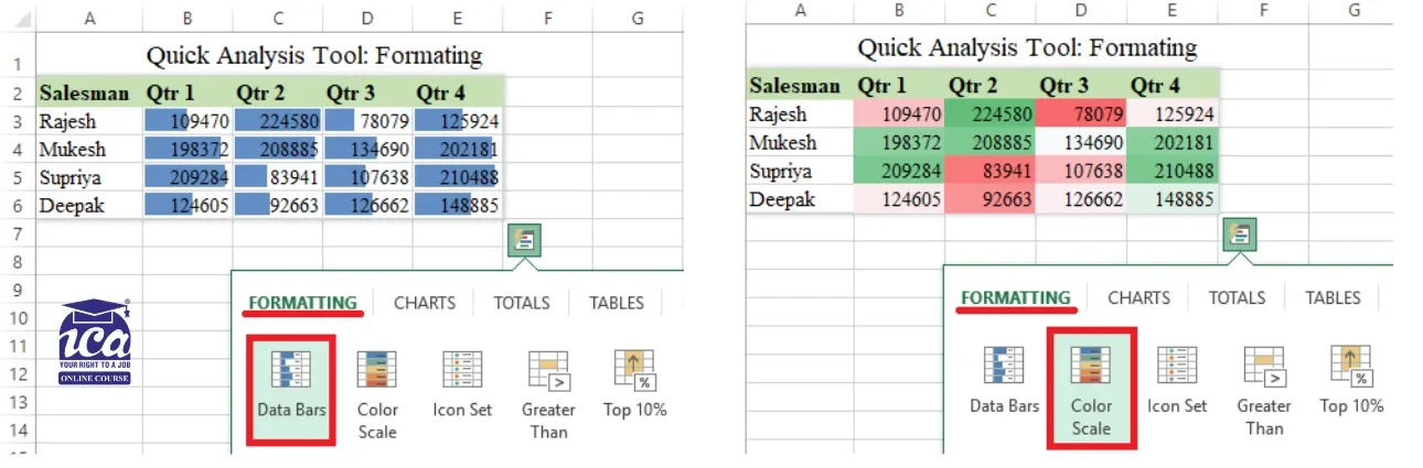
1. Formatting
Best for: Making specific data points stand out visually.
- Numeric Data: Add Data Bars (mini progress bars), Icon Sets (arrows/stoplights), or highlight the Top 10%.
- Text Data: Instantly find Duplicates, Unique Values, or specific words.
- Dates: Highlight days falling in Last Week, Last Month, or dates before/after a specific deadline.
Shortcut: Ctrl + Q → F
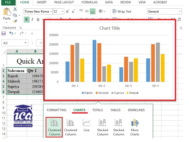
2. Charts
Best for: Creating a quick visual representation of your numbers. Excel intelligently suggests the best chart types (like Column, Bar, or Line) based on your selected data.
- Preview: Hover over a chart icon to see how it will look on your sheet.
- More Options: If the suggestion isn’t right, click More Charts to see the full library (Histograms, Scatter plots, etc.).
Shortcut: Ctrl + Q → C
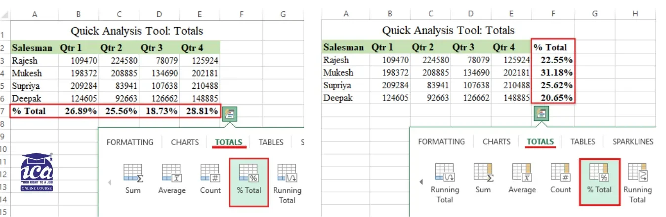
3. Totals
Best for: Running quick math on rows or columns. The tool automatically adds a new row or column for your calculations:
Common Stats: Sum, Average, Count, % Total, and Running Totals.
When you open the Totals tab, you’ll notice two different versions of the same icons (like Sum, Average, and Count). One set is blue, and the other is yellow. Understanding this distinction is the fastest way to master the tool:
| Icon Color | Where the Calculation Goes | Best For… |
|---|---|---|
| Blue Icons | The Bottom Row | Vertical analysis (e.g., “What is the total of this column?”) |
| Yellow Icons | The Right Column | Horizontal analysis (e.g., “What is the total for this specific row?”) |
Shortcut: Ctrl + Q → O
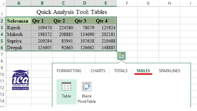
4. Tables & PivotTables
Best for: Organizing and summarizing large datasets.
- Tables: Converts your data into an official “Excel Table” with built-in filters and easy sorting.
- PivotTables: Creates a summary on a new sheet, allowing you to “slice and dice” complex data to find deeper insights.
Shortcut: Ctrl + Q → T
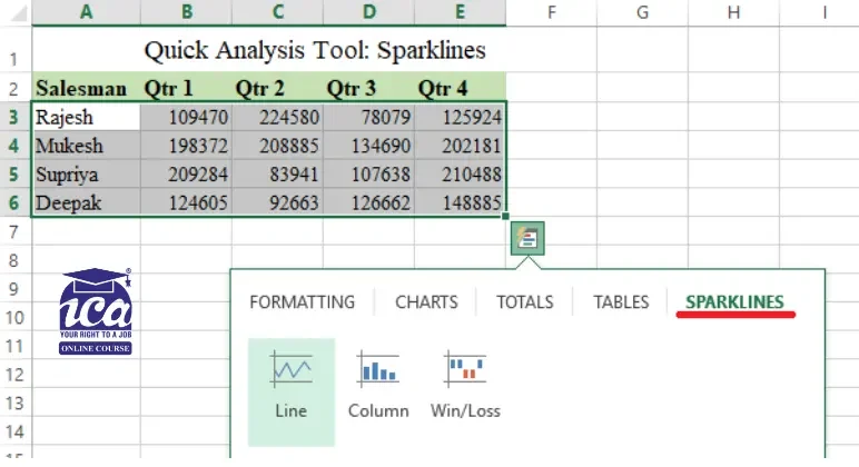
5. Sparklines
Best for: Showing trends in a very small space. Sparklines are “tiny charts” that live inside a single cell next to your data. They are perfect for dashboards where space is limited.
- Line: Shows continuous data (like stock prices).
- Column: Compares values side-by-side.
- Win/Loss: Best for tracking positive vs. negative results.
Shortcut: Ctrl + Q → S
Quick Tip
If you aren’t sure which one to use, hover your mouse over any option in the Quick Analysis menu. Excel will show you a live preview on your actual spreadsheet before you commit to the change!
Feature Comparison Table
| Feature | Best For | Primary Benefit |
|---|---|---|
| Formatting | Highlighting outliers | Visual data clarity |
| Charts | Visual presentations | Instant data storytelling |
| Totals | Quick math (Sum, Avg) | No manual formulas needed |
| Tables | Sorting and Filtering | Better data organization |
| Sparklines | Trend analysis | Compact visualization |

How to use Quick Analysis Tool in Excel
Using this tool is incredibly simple. Follow these steps to get started:
- Select Your Data: Highlight the cells you want to analyze. Ensure your data has headers for better results.
- Click the Icon: Look for the small Quick Analysis icon at the bottom-right of your selection.
- Use the Shortcut: Alternatively, press Ctrl + Q on your keyboard.
- Explore Options: Navigate through the tabs (Formatting, Charts, Totals, etc.).
- Preview and Apply: Hover over any option to see a preview. Click the one you like to apply it.
Why Use Quick Analysis Ctrl + Q ?
- No Formulas Required: It writes the math for you (like Sums and Percentages).
- Instant Previews: You can see how a chart or color scheme will look just by hovering your mouse over the options.
- Contextual Intelligence: It changes its suggestions based on what you’ve selected. If you select dates, it shows date filters; if you select numbers, it shows math totals.
Pros and Cons
| Pros | Cons |
|---|---|
| Extremely fast and user-friendly | Limited to five main categories |
| Live previews before applying | Not available for empty cells |
| Great for beginners | Advanced users may need more control |
Quick Analysis Examples
Here are real-world ways to use it. These practical examples will help you understand how the Quick Analysis Tool works in everyday Excel tasks and how you can apply it instantly to your own data.
1. Change a Regular Range into Excel Table
Converting your data into an official Excel Table is the best way to keep your work organized and automated. The biggest perk? Automatic expansion. When you add new rows at the bottom, Excel automatically applies all your existing formatting, formulas, and styles to the new data.
Here is how to do it in three quick steps using the Quick Analysis tool:
How to Create a Table
- Select your data: Highlight the entire range of cells you want to include.
- Open Quick Analysis: Click the small icon that appears in the bottom-right corner of your selection, or press Ctrl + Q.
- Choose Table: Click the Tables tab in the menu and select the Table option.
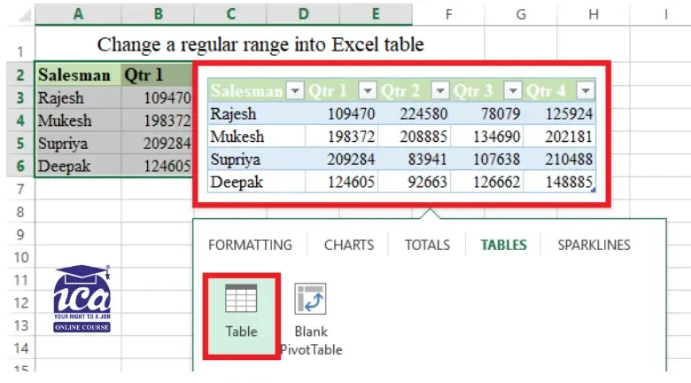
Tip: Once your data is in a table, it’s much easier to create PivotTables or Charts because Excel will always know exactly where your data starts and ends!
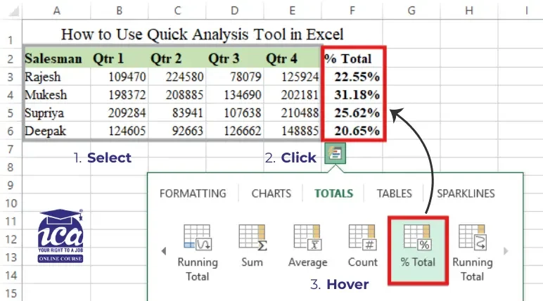
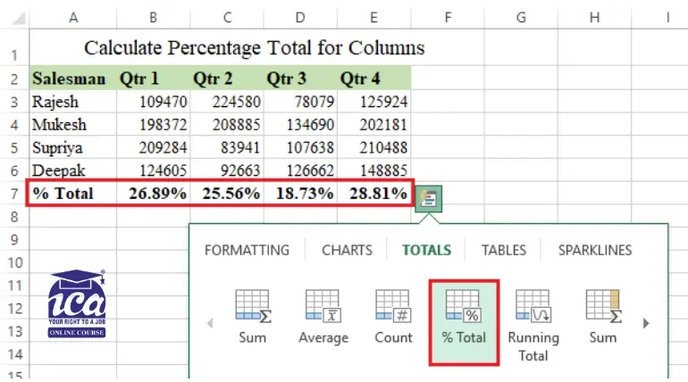
2. Calculate Percentage Total for Columns and Rows
To find out how much each item or month contributes to your overall sales, you can use the % Total feature. This avoids the headache of writing complex formulas manually.
A. Calculate % Total for Columns
This tells you what percentage of the “Grand Total” occurred in Quarter 1, Quarter 2, etc.
- Select your data and press Ctrl + Q.
- Go to the Totals tab.
- Look for the % Total icon with the blue highlight (this indicates a vertical calculation).
- Result: Excel adds a new row at the bottom showing the percentage for each column.
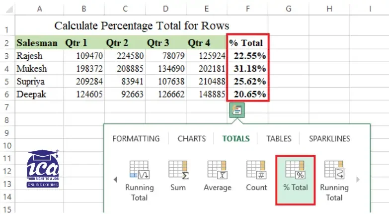
B. Calculate % Total for Rows
This tells you individual performances.
- Select your data and press Ctrl + Q.
- Go to the Totals tab.
- Scroll to the right (using the arrow) to find the % Total icon with the yellow highlight (this indicates a horizontal calculation).
- Result: Excel adds a new column on the right showing the percentage for each row.
Understanding the Formulas
If you click on one of these new percentage cells, you’ll see a formula in the bar. Depending on how your data is set up, it will look like: =SUM(B3:E3) / SUM($B$3:$E$6)
Don’t be intimidated! This just tells Excel to sum the current row and divide it by the total sum of the entire table.
If your data is a standard Range: =SUM(B3:E3) / SUM($B$3:$E$6)
- The Numerator (B3:E3): Sums the specific row you are looking at.
- The Denominator ($B$3:$E$6): Sums every single piece of data in your set. The $ signs (absolute references) lock the selection so that the “Grand Total” doesn’t shift when you move down the list.
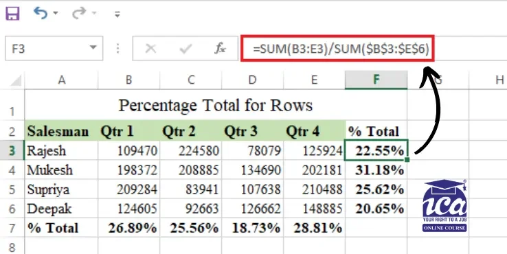
Tip: If you change a number in your original data, these percentages will automatically update. You don’t need to run the Quick Analysis tool again!
3. Highlight Cells Greater Than a Specified Value
If you need to quickly spot high-performing sales or values that exceed a specific budget, the Greater Than formatting rule is your best friend.
How to Highlight High Values
- Select your data and open the Quick Analysis menu (click the icon or press Ctrl + Q).
- Stay on the Formatting tab and select Greater Than.
- Set your threshold: A small box will pop up. Type in the number you want to compare against (e.g., if you type 100, every cell higher than 100 will light up).
- Pick a style: Choose your preferred look from the dropdown menu. The classic choice is Light Red Fill with Dark Red Text, but you can switch to Green if it’s a positive “win.”
- Click OK.
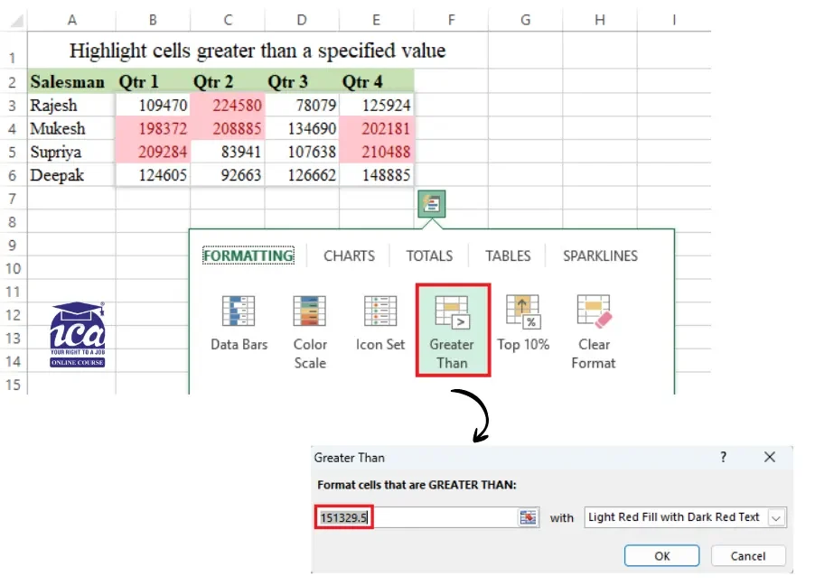
Tip: If you want to see the “top performers” without picking a specific number yourself, try the Top 10% option in that same menu. Excel will do the math and highlight only the highest values in your selection!
4. Create a Pie Chart
Creating a Pie Chart is one of the fastest ways to see how different parts of your data make up a whole (like market share or a monthly budget).
How to Insert a Pie Chart
- Select your data: Make sure to include both the labels (names) and the values (numbers).
- Open Quick Analysis: Click the icon in the corner or press Ctrl + Q.
- Go to Charts: Select the Charts tab.
- Preview & Pick: Hover your mouse over the Pie icon to see a live preview on your sheet. If you like it, click it to drop the chart right into your worksheet. Don’t see “Pie”? Click More Charts to find it in the full list.
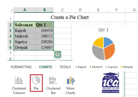
Why This Method is Better
- It’s Dynamic: If you created this chart from an Excel Table (as we did earlier), it becomes “smart.” When you add a new row or delete a record, the Pie Chart slices will automatically grow, shrink, or update themselves.
- Total Customization: Once the chart is on your sheet, a Chart Design tab will appear at the top of Excel. Use this to:
- Change the Color Palette.
- Add Data Labels (so people can see the exact percentages).
- Move the Legend or update the Chart Title.
Tip: Pie charts work best when you have five or fewer categories. If your “pie” has 20 tiny slices, it becomes hard to read, in those cases, a Bar Chart might tell your story more clearly!
5. Insert Sparklines
Sparklines are “miniature charts” that live inside a single cell. They are perfect for showing trends (like whether sales are going up or down over time) without taking up the space of a full-sized graph.
How to Create Sparklines
- Select your data: Highlight the rows of numbers you want to visualize.
- Open Quick Analysis: Click the icon in the corner or press Ctrl + Q.
- Choose your style: Go to the Sparklines tab and pick one of the three types:
- Line: Best for showing continuous trends over time.
- Column: Great for comparing individual values side-by-side.
- Win/Loss: Ideal for tracking positive vs. negative results (like gains and losses).
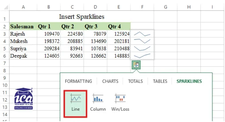
What Happens Next?
- Automatic Placement: Excel will instantly insert the mini-charts into the column immediately to the right of your data.
- Custom Design: Once created, a new Sparkline tab will appear in your top Ribbon. You can use this to change the colors, highlight the “High” or “Low” points, or switch the chart type if you change your mind.
Tip: Sparklines are “locked” to the data they represent. If you filter your list or hide a row, the Sparkline will update or hide along with it, keeping your dashboard neat and accurate!
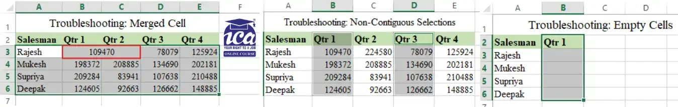
Troubleshooting: Why Your Quick Analysis Tool Isn’t Working
If you hit Ctrl + Q or highlight your data and nothing happens, don’t worry, you likely don’t need to reinstall Excel. There are a few common “blockers” and settings that can hide the tool. Here is how to get it back on track:
1. Check for “Data Blockers”
Before checking your settings, ensure your data is “clean.” The Quick Analysis tool will stay hidden if:
- The Merged Cell Trap: The tool hates merged cells. If your headers are merged or you have a “Total” label merged at the bottom, Excel gets confused and disables the lightning bolt icon.
- Non-Contiguous Selections: You cannot use this tool if you have selected multiple separate ranges (e.g., holding Ctrl to select Column A and Column D). It only activates for a single, solid block of data.
- Empty Cells: The tool will not appear if you select a range that is entirely empty or consists only of a single cell.
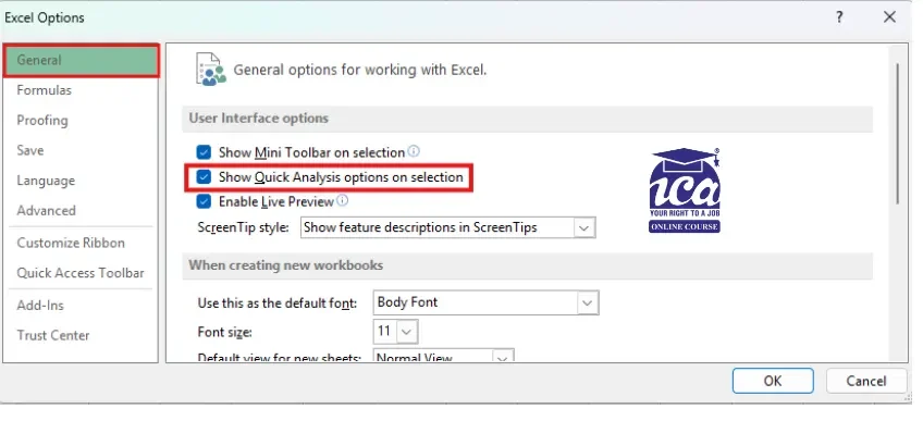
2. Enable the Feature in Settings
If your data is clean but the icon still won’t appear, the feature might be turned off in your Excel options:
- Go to File > Options.
- In the General tab, look under the User Interface options section.
- Ensure the box “Show Quick Analysis options on selection” is checked.
- Click OK and try selecting your data again.
3. Compatibility & Version Check
- Check Your Version: This tool was introduced in Excel 2013. If you are using Excel 2010 or older, you will need to perform these tasks manually via the Ribbon.
- The Mac Limitation: Currently, the “lightning bolt” icon and the Ctrl + Q shortcut are specific to the Windows version of Excel. Mac users should use the “Recommended Charts” or “Analyze Data” features in the Home tab for similar results.
- The “Table” Conflict: If your data is already formatted as an official Excel Table (Ctrl + T), the “Tables” tab within the Quick Analysis menu will disappear because the data is already in a table format.
4. The Quick Fixes
- Use the Shortcut: If the icon doesn’t pop up visually, try forcing it by pressing Ctrl + Q immediately after selecting your data.
- Restart Excel: Occasionally, a temporary glitch can cause UI elements to disappear. A quick “off and on again” usually clears this up.
Tip: If you’ve tried everything and it still won’t work, ensure you aren’t in “Cell Edit Mode” (where your cursor is blinking inside a cell). The tool only appears when you have a range selected, not when you are typing inside one.
Best Practices for Success
To get the most value out of your data with minimal effort, keep these tips in mind:
- Start with an Overview: Use the tool as a “first look” to spot obvious trends or outliers before you start building complex reports.
- Experiment Freely: Since the tool provides instant previews, hover over different charts and sparklines to see which visual “tells the story” most clearly.
- Don’t Stop at the Default: The Quick Analysis tool creates the foundation. You can still use the Chart Design or Format tabs to change colors and fonts to match your brand or presentation style.
- Spot “Deep Dive” Opportunities: Use the Totals or Formatting features to highlight unusual numbers that might need a more detailed investigation later.
Few insightful articles on Excel to improve your knowledge:
The “Exit Strategy”: When to Stop Using Quick Analysis
The Quick Analysis tool is like training wheels, it’s brilliant for getting started, but it has limits. To be a true Excel power user, you need to know when to put it away:
- When Data Exceeds 10,000 Rows: Quick Analysis creates “Static” or “Standard” formulas. On massive datasets, these can slow down your workbook. For big data, you should skip the tool and use Power Query or Pivot Tables for better performance.
- When You Need Custom Logic: The “Totals” tab only offers basic math (Sum, Avg, Count, etc.). If you need a weighted average or a VLOOKUP within your analysis, the tool can’t help you.
- For Presentation-Ready Dashboards: The “Charts” tab in Quick Analysis only gives you the defaults. It’s great for a “quick look,” but for a formal report, you’ll still need to use the Chart Design and Format tabs to remove clutter and match your brand’s styling.
Quick Analysis vs Pivot Table vs Power Query
| Feature | Quick Analysis | Pivot Tables | Power Query |
|---|---|---|---|
| Best For | 2-second “sanity checks” | Summarizing & slicing data | Cleaning “messy” data |
| Data Size | Small | Medium to Large | Very Large (Millions of rows) |
| Effort | One-click (Ctrl + Q) | Drag-and-drop | Step-by-step automation |
| Flexibility | Low (Default options only) | High (Custom grouping) | Infinite (Advanced shaping) |
| Updates | Static (Manual refresh) | Dynamic (Click Refresh) | Fully Automate |
The Verdict: Use Quick Analysis for “Drafting” and “Sanity Checks.” Use manual formulas and Pivot Tables for “Final Products.”
Conclusion
The Quick Analysis Tool in Excel is not just a beginner shortcut, it’s a speed weapon. In seconds, you can turn raw data into charts, totals, trends, and insights without touching a single formula.
But remember this: it’s built for speed, not complexity. Use it to explore, validate, and draft your analysis. When your data grows or your logic becomes advanced, move to PivotTables or Power Query for deeper control.
Master this tool, and you’ll stop “working in Excel” and start thinking like someone who actually understands it. Start using Ctrl + Q today, and let Excel do the heavy lifting.
Frequently Asked Questions
1. Why is the Quick Analysis Tool in Excel not appearing?
The tool usually appears automatically. However, if it doesn’t, you might have it disabled. Go to File > Options > General and ensure the “Show Quick Analysis options on selection” box is checked. Also, remember it won’t show up if you select empty cells or entire columns.
2. Is there a keyboard shortcut for the Quick Analysis Tool?
Yes! The fastest way to open it is by pressing Ctrl + Q after selecting your data. This works in almost all modern versions of Excel for Windows.
3. Can I create a PivotTable using this tool?
Absolutely. Under the Tables tab in the Quick Analysis menu, you will see a PivotTable option. Hovering over it will even show you a suggested layout for your data.
4. Does the Quick Analysis Tool work on Mac?
Currently, the “lightning bolt” icon and the Ctrl + Q shortcut are specific to the Windows version of Excel. Mac users use the “Recommended Charts” or “Analyze Data” features in the ribbon for similar results.
5. Can I use the Quick Analysis Tool for conditional formatting?
Yes, this is one of its best uses. The Formatting tab allows you to apply data bars, color scales, and icon sets instantly without opening the full Conditional Formatting menu.