
10 Power BI Dashboard Hacks That’ll Explode Your Data Game Overnight
Stop building dashboards that executives glance at for five seconds and forget. These 10 Power BI Dashboard hacks from DAX wizardry to AI Copilot integration will make your reports the ones people actually use to make decisions.
Here’s a brutal truth about Power BI Dashboards: 73% of business dashboards are opened once and never used again. Not because the data is bad because the dashboard experience is.
You’ve probably built beautiful reports in Power BI Desktop, published them to Power BI Service, and then watched the adoption stall. Executives ask for “simpler.” Analysts say it’s “too slow.” And you’re left wondering where it all went wrong.
These aren’t theoretical tips lifted from Microsoft documentation. These are battle-tested Power BI Dashboard hacks drawn from real enterprise implementations, DAX performance wars, and UX psychology research that produce measurably better dashboards. Let’s get into it.
- 35% Faster decision-making with well-designed dashboards
- 70% Load time reduction via data type optimization
- 65% Higher user engagement with professional design
- 60% Adoption boost from cognitive-mapped layouts
Table of Contents
- 1. Use Dynamic, Context-Aware Titles with DAX Measures
- 2. Master the Star Schema for Sub-3-Second Load Times
- 3. Build Report-Level Tooltip Pages
- 4. Apply the F-Pattern Layout for Executive Dashboards
- 5. Leverage Bookmarks + Buttons for Zero-Code Navigation
- 6. Use Calculation Groups Instead of Duplicate Measures
- 7. Implement Row-Level Security Without IT’s Help
- 8. Activate Power BI Copilot for AI-Powered Summaries
- 9. Design a Mobile-First Canvas Layout
- 10. Set Up Incremental Refresh to Slash Dataset Reload Time
- The Bottom Line
- Power BI Dashboard Common Questions
1. Use Dynamic, Context-Aware Titles with DAX Measures
Hard-coded titles are the single biggest sign of an amateur Power BI Dashboard. When a user selects Europe from a slicer, your dashboard title should automatically read Europe Sales Q1 2025 (€42.1M, +19% vs LY) not just Sales Dashboard.
This hack uses DAX string concatenation to build context-sensitive titles that reflect the current filter state. The result? Every screenshot, every exported PDF, every shared link carries a self-documenting title with zero manual updates required.

Add this measure to a Card visual and set it as your page header using a custom text box with the measure value embedded. This technique also works for subtitle text, KPI context labels, and conditional chart annotations.
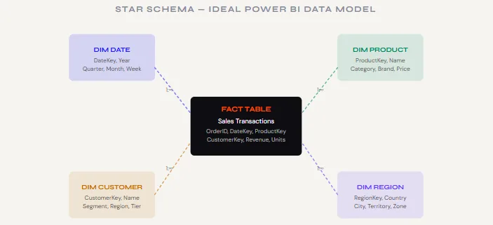
HASONEVALUE() to show Multiple Regions Selected gracefully when users pick more than one filter. This prevents empty or broken titles in cross-filter scenarios.2. Master the Star Schema for Sub-3-Second Load Times
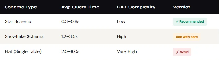
The number one reason Power BI Dashboards feel sluggish isn’t your visuals, it’s a broken data model. A messy snowflake schema or unresolved many-to-many relationships forces Power BI’s query engine to do exponentially more work on every render.
The fix is the star schema: one central fact table (your transactions, events, or metrics) surrounded by clean dimension tables (Date, Product, Customer, Region). Every relationship is one-to-many, every join is clean, and DAX measures resolve in milliseconds instead of seconds.
3. Build Report-Level Tooltip Pages
This is one of the most jaw-dropping Power BI Dashboard tricks you can show a client. Instead of cluttering your dashboard with secondary charts, you hide them in a dedicated tooltip page and they appear as a rich, full visual when a user hovers over any data point.
- Create a new page and rename it Tooltip [Chart Name]
- Go to Format → Page Information → toggle Tooltip to ON
- Set Page Size to Tooltip (320×240px is ideal)
- Switch View to Actual Size while designing (prevents layout surprises)
- On the source visual, open Format → Tooltip → set Type to “Report page” and select your tooltip page
Use this technique to show a sparkline trend on hover over a KPI card, a product breakdown on hover over a bar segment, or a regional map on hover over a territory name. Your main canvas stays clean; the context appears exactly when needed.
4. Apply the F-Pattern Layout for Executive Dashboards
Eye-tracking research consistently shows that executives scan dashboards in an F-pattern with a strong horizontal sweep at the top, a second sweep slightly below, then a vertical scan down the left edge. Designing against this pattern is why so many Power BI Dashboards get ignored.
The winning layout places your single most critical KPI top-left, supporting KPI cards across the top row, your primary trend chart spanning the full width below, and breakdowns (by region, product, channel) in the lower half.
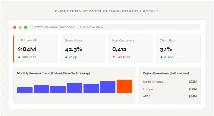
Notice the deliberate empty space (whitespace) between visual groups. Generous whitespace is not wasted space; it reduces cognitive load and directs attention. Dashboards that breathe get used. Dashboards that suffocate get ignored.
5. Leverage Bookmarks + Buttons for Zero-Code Navigation
Most Power BI users don’t know that Bookmarks Power BI’s “saved state” snapshots can be triggered by custom buttons to create smooth, app-like navigation experiences. No custom visuals, no JavaScript, no Premium license required.
The classic use case: a “Summary / Detail” toggle. Users land on a clean executive view, tap a “Deep Dive →” button, and the same report page instantly switches to a data-dense analyst view. One report page, two experiences, zero confusion.
- Design your two (or more) visual states on the same canvas use the Selection pane to toggle which visuals are visible
- With State A visible, go to View → Bookmarks → Add Bookmark → rename it “Executive View”
- Toggle to State B, add another bookmark: “Analyst View”
- Insert a Button → set Action Type to Bookmark → select the target bookmark
- Format buttons with your brand colors and descriptive labels
6. Use Calculation Groups Instead of Duplicate Measures
You’ve probably built this before: [Revenue YTD], [Revenue MTD], [Revenue LY], [Revenue YTD LY], [Gross Margin YTD], [Gross Margin MTD]… and so on until you have 40 measures that are 90% identical. This is the measure sprawl problem, and Calculation Groups is the cure.
Calculation Groups let you define time intelligence logic once YTD, MTD, QTD, LY, Forecast and apply it dynamically to any base measure. One measure + one calculation group = unlimited time comparison combinations, with a fraction of the maintenance overhead.

7. Implement Row-Level Security Without IT’s Help
Row-Level Security (RLS) is the mechanism that shows a regional manager only their region’s data even when they’re looking at the same shared Power BI Dashboard as a global VP who sees everything. Most teams delay RLS because they think it requires IT. It doesn’t.
Dynamic RLS uses a single DAX filter that references the logged-in user’s email address (USERPRINCIPALNAME()) against a security mapping table you control. Once published to Power BI Service, the filter enforces automatically per user no separate reports, no manual data splits.

- Create a UserSecurity table in your data source: columns UserEmail + AllowedRegion
- In Power BI Desktop → Modeling → Manage Roles → create a role RegionalFilter
- Apply the DAX filter above to your UserSecurity table
- In Power BI Service → Dataset → Security → assign users/groups to the RegionalFilter role
- Test with View as Role feature before going live
8. Activate Power BI Copilot for AI-Powered Summaries
Power BI Copilot (available with Fabric/Premium Per User) is not just a gimmick used correctly, it transforms your dashboard from a data display into a decision-support tool. The Smart Narrative visual and Copilot’s conversational Q&A can generate natural-language summaries of your data in real time, automatically updating as filters change.
The key to getting useful output is to train Copilot with business context. Don’t just enable it and hope for the best. Go into your dataset properties and add field descriptions for every key measure. When Copilot knows that “Conversion Rate means leads divided by MQLs in the last 30 days, with a target of 18%,” its summaries shift from generic to genuinely actionable.
For teams without Copilot licensing, the free Smart Narrative visual provides a lighter version of the same functionality; it autogenerates text summaries of selected visuals using a configurable template. Combine it with dynamic titles (Hack #1) for a fully self-narrating dashboard that explains itself.
9. Design a Mobile-First Canvas Layout
Microsoft’s mobile layout editor exists; almost nobody uses it. That’s a mistake. A significant portion of executive Power BI Dashboard views happen on phones, and a desktop report viewed on mobile is a pinch-and-zoom nightmare that destroys adoption.
The mobile layout editor lets you create a completely separate arrangement of your existing visuals for the Power BI mobile app with no duplicate work, no separate reports. You’re rearranging and resizing the same visuals from your desktop canvas into a vertical, single-column stack optimized for portrait mode.
- In Power BI Desktop: View → Mobile Layout (toggle)
- Drag your KPI cards from the “Visualizations” panel on the right into the phone canvas prioritize your top 3-4 metrics
- Add your primary trend chart below, full-width
- Skip complex matrices and tables replace with simplified card visuals on mobile
- Test on the Power BI mobile app before publishing scroll behaviour often reveals sizing issues invisible on desktop
10. Set Up Incremental Refresh to Slash Dataset Reload Time
If your Power BI Dashboard pulls from a large dataset (millions of rows, multi-year history), full daily refreshes can take 20–40 minutes and during that window, your dashboard is unavailable or showing stale data. Incremental Refresh solves this by only loading new or changed data on each cycle.
Instead of reimporting 5 years of transactions daily, you configure a rolling window: keep 3 years of history frozen, refresh only the last 14 days. A refresh that took 30 minutes now completes in under 3 minutes.
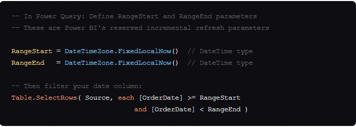
- Create RangeStart and RangeEnd parameters in Power Query (exact names required)
- Apply a date filter using these parameters on your fact table’s date column
- Right-click the table in Model view → Incremental Refresh
- Configure: Store 3 years / Refresh last 14 days
- Publish to Power BI Service first refresh is full, all subsequent ones are incremental
The Bottom Line
A great Power BI Dashboard is not a gallery of charts it’s a decision-making instrument. The hacks above address the three layers that determine whether a dashboard succeeds or gets abandoned: performance (Hacks 2, 10), clarity (Hacks 1, 3, 4, 9), and depth (Hacks 5, 6, 7, 8).
Start with the hack that addresses your biggest current pain point. If your dashboard is slow: Star Schema and Incremental Refresh first. If it’s not being adopted: F-Pattern layout and Dynamic Titles. If leadership keeps asking “what does this mean?”: Copilot and Tooltip pages.
Build dashboards that answer questions, not ones that display data. That’s the difference between a report that gets shared in Monday standup and one that sits forgotten in a workspace.
Few MIS related topics for your knowledge
Power BI Dashboard Common Questions
1. What is the difference between a Power BI Report and a Power BI Dashboard?
A Power BI Report is a multi-page, interactive canvas created in Power BI Desktop with detailed visuals, slicers, and drill-throughs. A Power BI Dashboard is a single-page canvas in Power BI Service where you pin the most important visuals from one or multiple reports. Reports are for analysis; dashboards are for monitoring at a glance.
2. How many visuals should a Power BI Dashboard have?
Best practice is 5–7 visuals maximum on a dashboard tile view, and no more than 8 visuals per report page for optimal performance. The human brain processes about six chunks of information simultaneously exceeding this limit increases cognitive load and reduces comprehension. Use drill-through pages and tooltip pages for secondary detail rather than cramming everything onto one canvas.
3. Is Power BI Dashboard free?
Power BI Desktop (for building reports) is completely free. Power BI Service has a free tier with limited sharing. Power BI Pro ($10/user/month) is required to share dashboards with other licensed users. Power BI Premium Per User ($20/user/month) unlocks Copilot, Incremental Refresh with historical data, and paginated reports.
4. What data sources can Power BI connect to?
Power BI connects to over 200 data sources natively, including Excel, SQL Server, Azure Synapse, SharePoint, Salesforce, Google Analytics, Dynamics 365, SAP, Oracle, REST APIs, and web scraping. Connections can be Import mode (data cached in memory) or DirectQuery (live queries to the source), with hybrid Composite Models available for combining both.
5. How do I make a Power BI Dashboard load faster?
The four highest-impact optimizations are: (1) implement a star schema data model, (2) use DAX measures instead of calculated columns, (3) limit visuals to 8 or fewer per page, and (4) enable Incremental Refresh for large historical datasets. Additionally, hosting your Power BI tenant and data source in the same Azure region reduces network latency significantly.

- Get Hired Quickly: Top Tally Classes Online for High-Paying Jobs - July 10, 2026
- Accounting Courses Online with Certificate: Your 2026 Career Launchpad - July 3, 2026
- SAP FICO Career Guide for Freshers: How to Land Your First Job - June 26, 2026